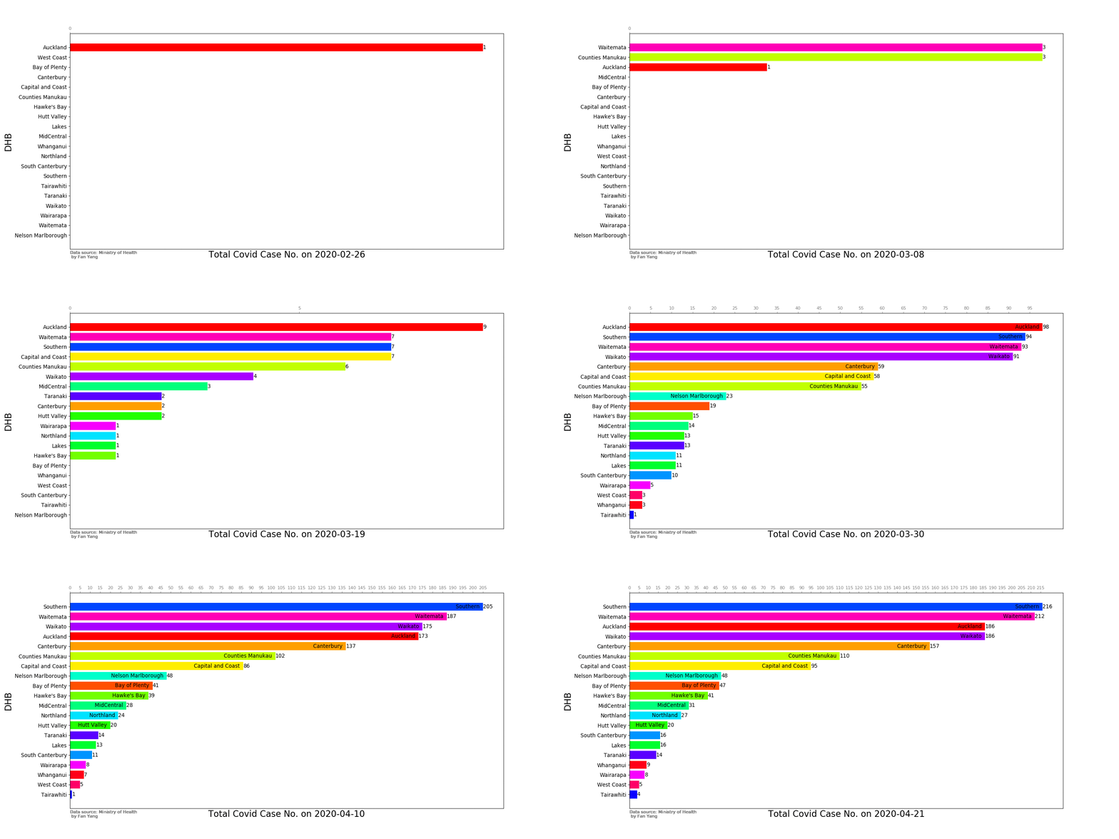
Read the data from excel
import pandas as pd
from pandas import DataFrame, Series
import matplotlib.pyplot as plt

df = pd.read_excel('covid-caselist-23april.xlsx',sheet_name= 'Confirmed')
The excel file is from the Ministry of Health website on 23/04/2020.
Data Wrangling
The raw data need to be properly treated for the plotting purpose.
df.replace(to_replace=r'^\s*$',value='Unkown',regex=True,inplace=True)#replace the emply values with 'No_data'

df.columns = list(i.replace(' ','_') for i in df.columns)# Replace the space in the columns name to avoid potential problems
df = df.rename(columns = {'Date_of_report':'Report_Date','International_travel':'Overseas','Age_Group':'Age_group'})

df['Report_Date'] =pd.to_datetime(df['Report_Date'],format='%d/%m/%Y')
df.sort_values(by ='Report_Date', axis=0, inplace= True )

df5 = df.groupby(['Report_Date','DHB']).count()
df5 = df5.iloc[:,1]
df5 = df5.unstack().fillna(0).astype('int32')

#calculate the total case number until the target date
df_cum = df5.cumsum()
# resample the data to 8 hours and interpolate the data to get more figures
df_cum = df_cum.resample('8h').interpolate().astype('int32')

#get the timeline stamp for later use
newDatetime = df_cum.index.date

df_cum = df_cum.T

#create a random color list for different cities, you can set the color list for better result
color_list = []
cmap = get_cmap(len(df_cum.index))

for i in range(len(df_cum.index)):
   color_list.append(cmap(i))
df_cum['color_list'] = color_list

ylist = range(len(df_cum.columns))
Plotting the figures
#prepare the fig
fig, ax = plt.subplots(figsize=(18, 9))

 # ffmpeg need to be installed in the system to produce the videos
Writer = animation.writers['ffmpeg']
writer = Writer(fps=10, metadata=dict(artist='Me'), bitrate=800)


# define the function to generate the figures
def animate(i):
    ax.clear()  #everytime the existing figure need to be cleared
    df24 = df_cum.iloc[:,[i,-1]].sort_values(by = df_cum.columns[i])
    wdf = df24.iloc[:,0]
    color_list2 = df24.iloc[:,-1]

    #process bar
    process= i/(len(newDatetime)-1)*100
    print("\r  Plotting process:%.2f%%" %(process),end=' ')
    if process>99:print("\r  DONE!     Plotting process:     100%",end=' ')

    # the figure
    ax.barh(wdf.index, wdf.values, color=color_list2)
    ax.set_xlabel('Total Covid Case No. on {}\n'.format(newDatetime[i]), fontsize=20)
    ax.set_ylabel('DHB', fontsize=20)

    # the ticks
    ax.yaxis.set_tick_params(labelsize=12, colors='black')
    ax.xaxis.set_tick_params(labelsize=10, colors='grey')
    ax.tick_params(top = True, bottom = False, labeltop = True, labelbottom = False)
    ax.xaxis.set_ticks(np.arange(0, ((max(wdf))+1), 5))

    for x, y in zip(wdf.values, range(len(wdf.values))):
        ax.text(x, y, ('' if x < 1 else int(x)), ha='left', va='center', fontsize=12)
        ax.text(x, y, ('' if x < 20 else '{}  '.format(wdf.index[y])), ha='right', va='center', fontsize=12)
        ax.text(0, -2, 'Data source: Ministry of Health\n by Fan Yang', ha='left', va='center', fontsize=10,
                color='grey')

# generate the photos
ani = animation.FuncAnimation(fig, animate, frames=range(len(df_cum.columns)-2), interval=200)
Various outputs
print('*******Beign to plot the mp4 figure file********')
ani.save("test2.mp4", writer=writer)


print('\n*******Beign to plot the figure file in gif*********')
ani.save('line2.gif', dpi=80, writer='imagemagick')

print('\n*******show in the IDE environment*********')
plt.show()
Result
MP4 VIDEO
JPG Animation photos